Project Overview
Project Goal:
- To design and develop a visually cohesive, user-friendly, and responsive website for SFU Climate Community.
- Ensuring smooth navigation, accessibility, and an engaging browsing experience across desktop and mobile platforms.
My Role: Web Designer & Developer
Built With:
- Figma (initial concept design)
- Visual Studio Code (programming)
- HTML&CSS
Work Time: 2 Months (February 2024 - April 2024)
Showcase:
Project Description
A Seamless and Engaging Experience
I designed and developed the SFU Climate Community website, creating a visually cohesive, user-friendly, and responsive experience across desktop and mobile platforms. Using Figma, I crafted an intuitive layout that clearly presents the community’s mission and ensures smooth navigation. I then implemented the design with HTML and CSS, optimizing interactive elements such as the Guide and See More buttons to enhance accessibility and engagement.
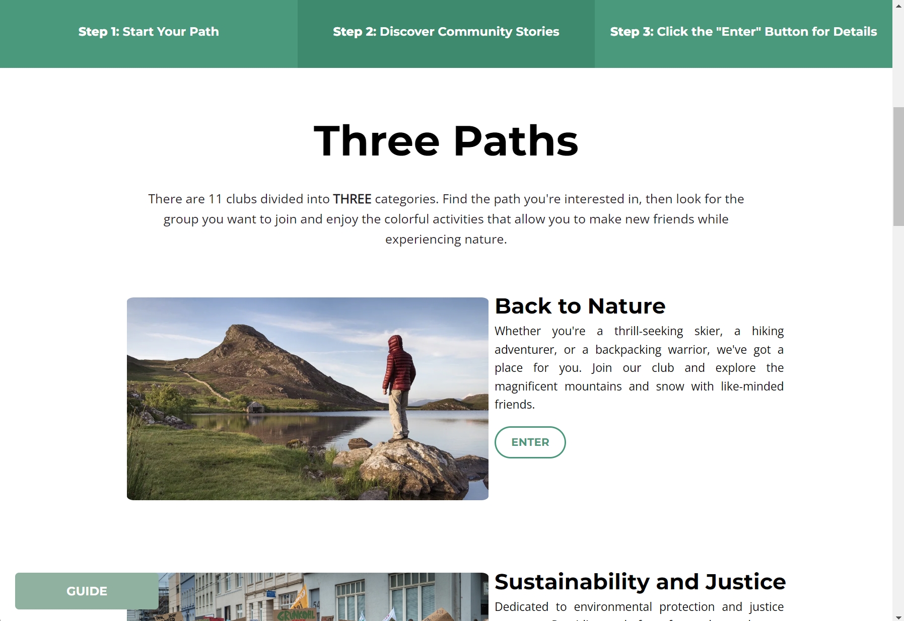
Scroll down for the rest of the site and follow the three steps described in the navigation to find the content of interest quickly.
Clicking SEE MORE reveals an arrow guiding users to specific content.

The GUIDE button can be expanded.
Development
Guide Button
- The Guide Button in the lower-left corner provides a quick and intuitive way to access site navigation.
- With a single click, users can expand or collapse a structured overview of the website.
- This feature enhances accessibility by offering clear guidance at any stage of the browsing experience.
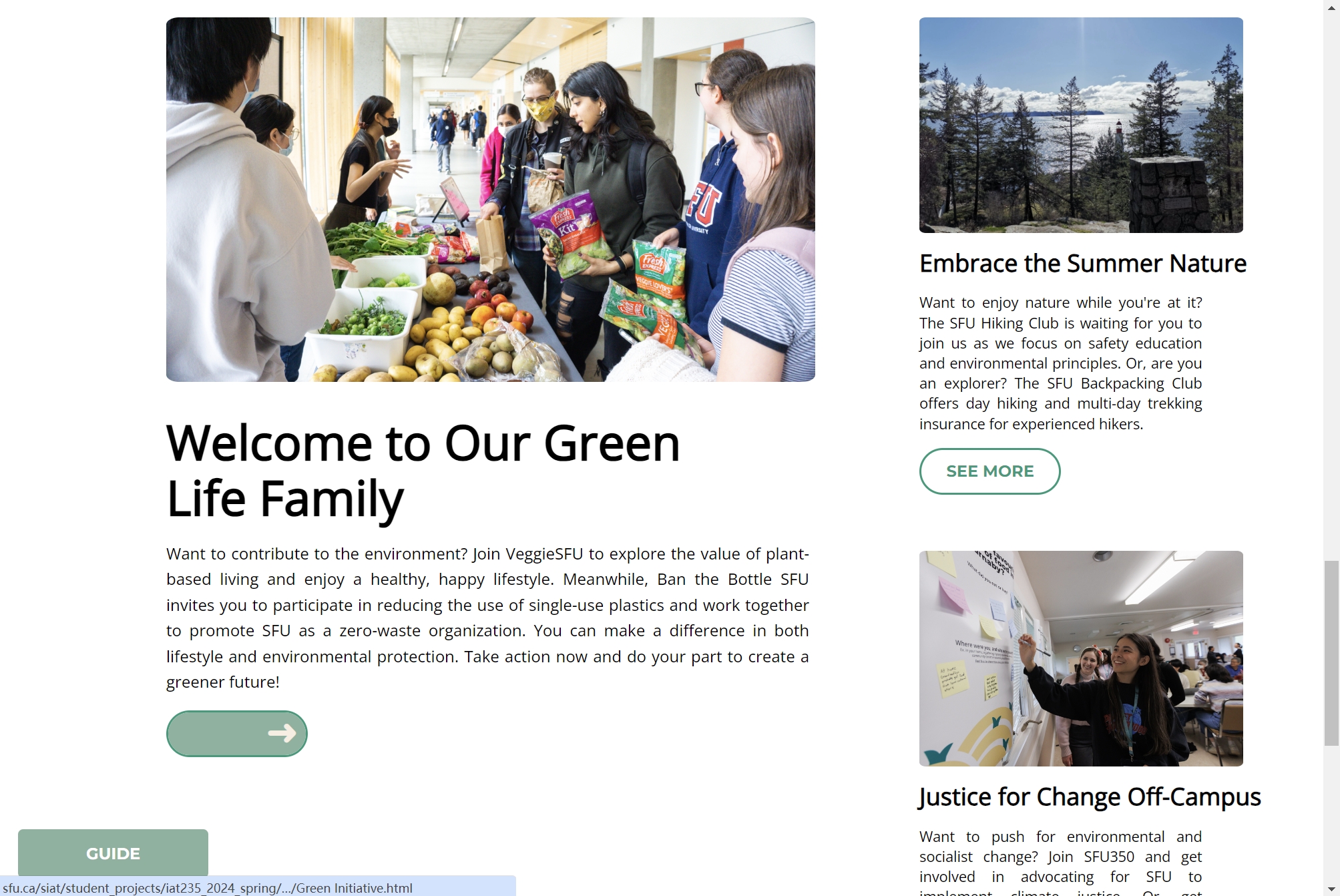
See More Button
- At the bottom of the homepage, See More invites users to explore in-depth stories about community activities.
- When clicked, an arrow animation smoothly guides users to the next section.
- This dynamic interaction enhances engagement, encouraging users to discover more about the SFU Climate Community.
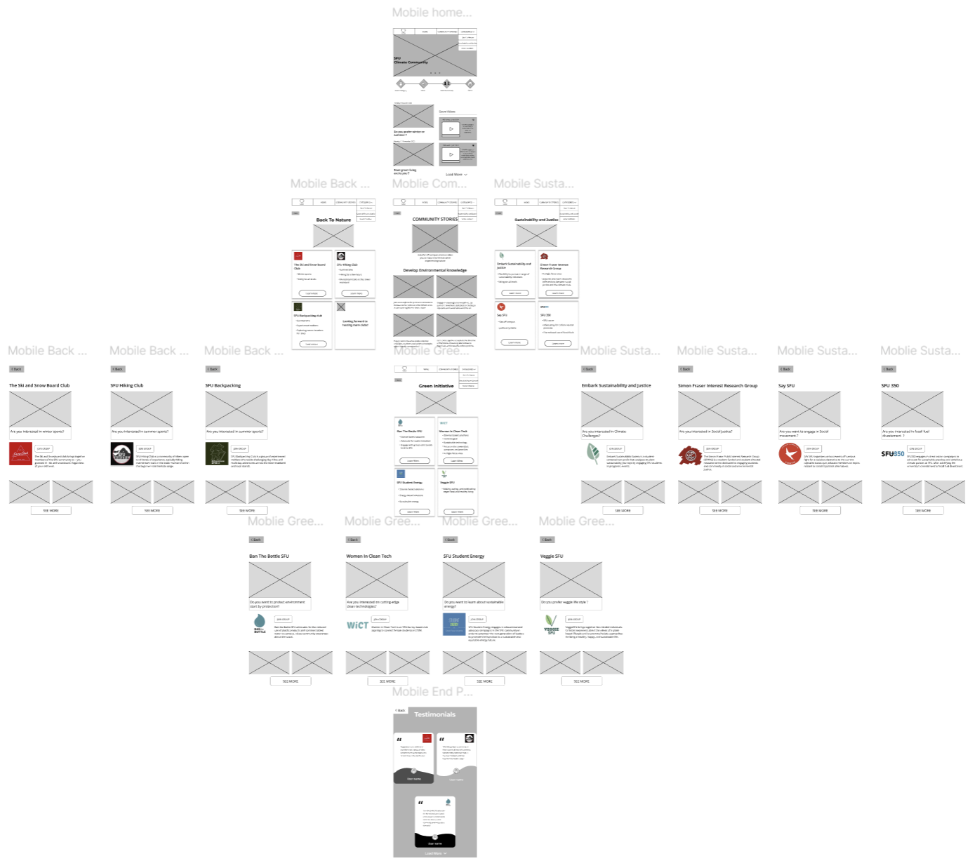
Mobile View
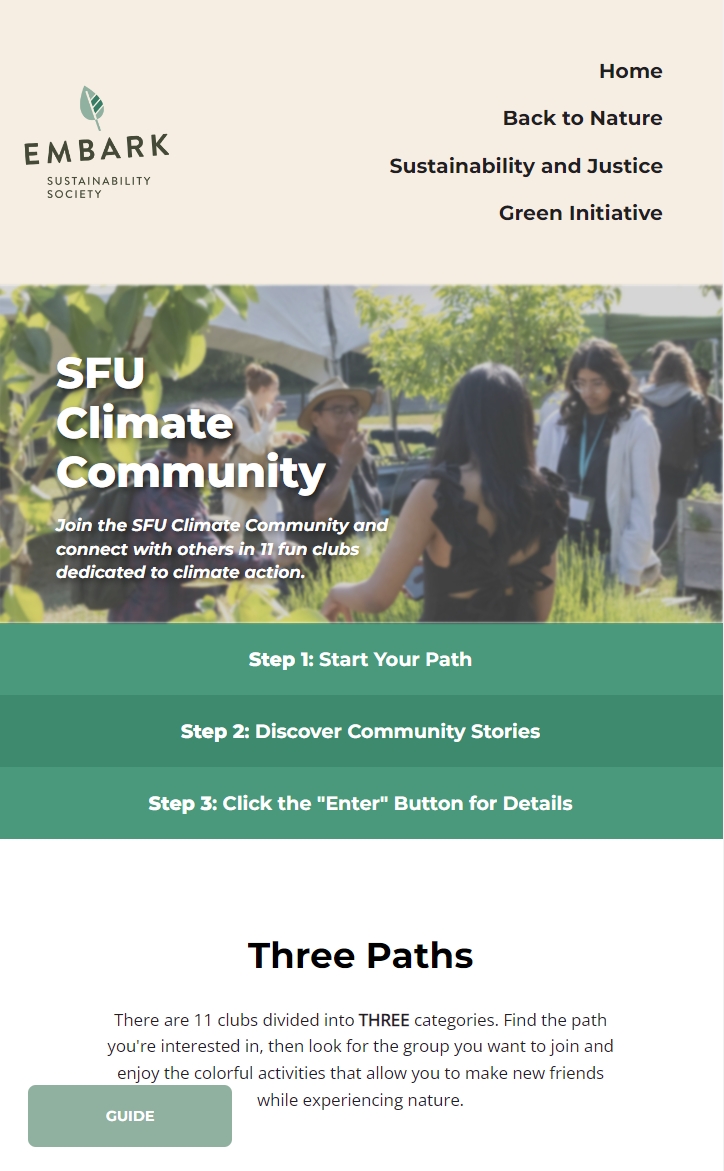
- A mobile view of the website layout, ensuring accessibility across different screen sizes.
- Optimized for both desktop and mobile users.
- Provides a consistent browsing experience regardless of device.
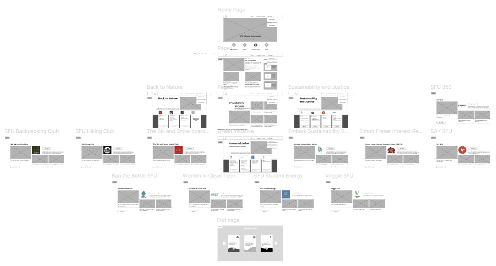
Design
Desktop Website Design
by creating a structured, visually cohesive, and user-friendly layout with clear navigation, balanced visual hierarchy, and smooth content flow for an engaging browsing experience.
Mobile Website Design
For the mobile version, I focused on responsive and intuitive design, ensuring seamless adaptation, touch-friendly interactions, and optimal readability while maintaining consistency with the desktop layout.
Code Implementation
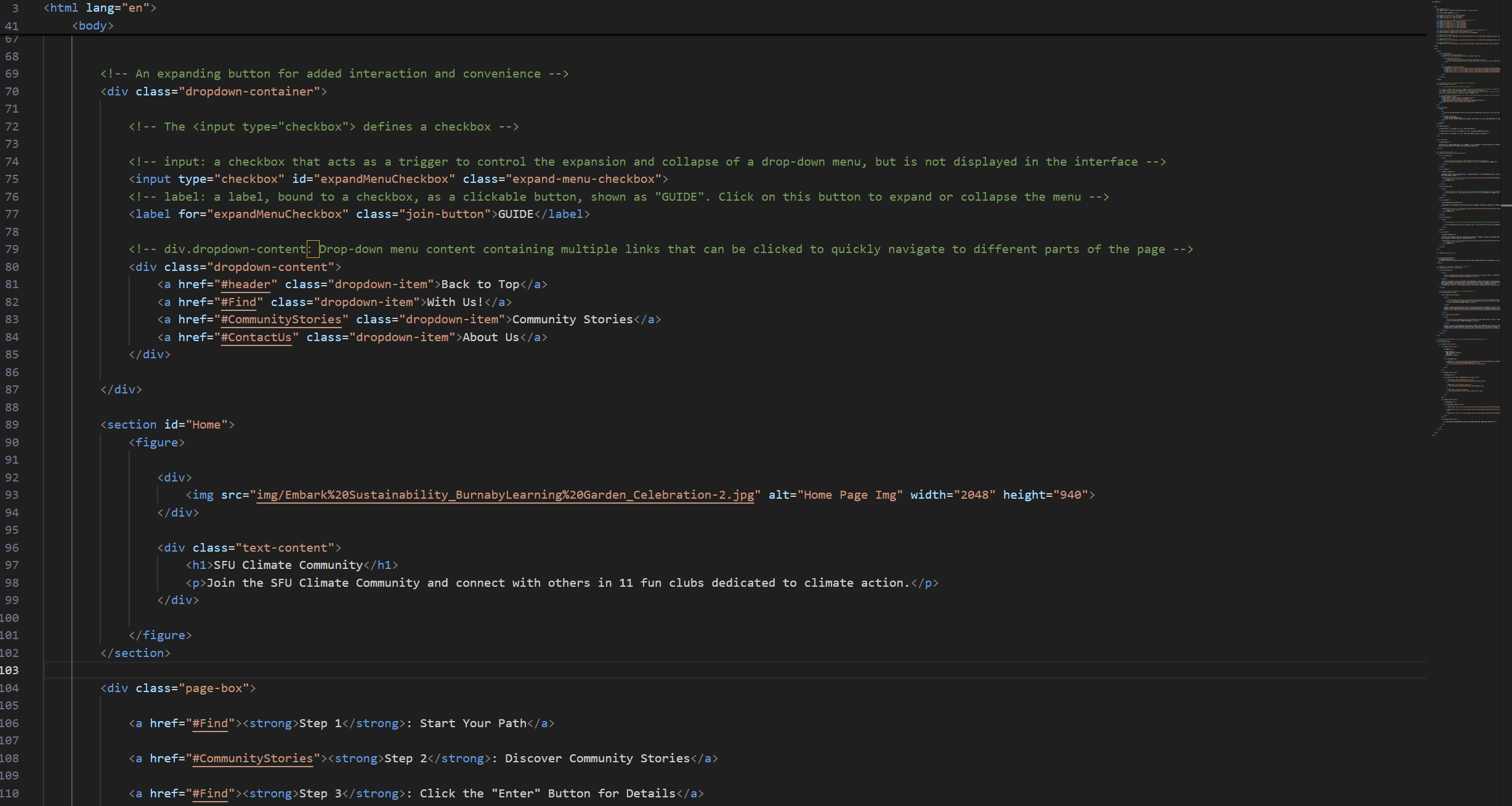
HTML
A sample of the code for the homepage I created, including the GUIDE and Navigation functions.
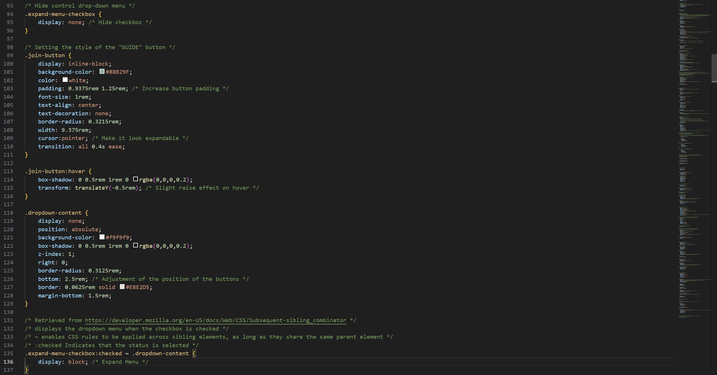
CSS
A sample CSS part of the code for the expand function.
Takeaways
This project strengthened my ability to create intuitive and responsive web designs, balancing aesthetics with functionality. I refined my skills in HTML, CSS, and Figma, ensuring seamless navigation and accessibility across devices. Through interactive elements like the Guide and See More buttons, I enhanced user engagement, improving the overall browsing experience.